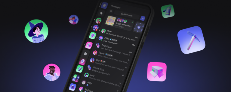
Discord has published a blog post outlining ongoing work to bring the mobile app closer in line with its desktop counterpart. The effort focuses on refining visual elements and layout to create a more consistent experience across platforms. According to the update, the changes include adjustments to server icons and the chat bar, alongside a broader redesign that introduces squircle shapes, updated styles, and improved spacing.
The redesign incorporates squircle‑shaped icons and refined visual styling, which Discord says are part of a push to modernize the interface while maintaining familiarity. Spacing between elements has also been revisited to improve readability and touch targeting on mobile devices. These tweaks are intended to make navigation feel more uniform whether users are on a phone, tablet, or computer.
A notable highlight mentioned in the post is the return of the Ash dark theme, described as the original dark mode option that many users have long preferred. Its reintroduction gives creators and community managers an additional visual choice that matches the aesthetic they may already use on desktop.
For creators, a more aligned mobile and desktop experience can simplify community management. Consistent iconography and layout reduce the learning curve when switching between devices, allowing moderators and content producers to focus on engagement rather than relearning interface differences. The updated spacing and touch targets also aim to make routine tasks—such as navigating channels, reacting to messages, or managing server settings—more efficient on handheld devices.
Discord emphasizes that these changes are shaped directly by community feedback. By listening to how creators and everyday users interact with the app, the team is prioritizing adjustments that address real‑world usage patterns. The blog post signals that further refinements will continue as the platform works to close the gap between its mobile and desktop experiences.
Join the conversation
Load Facebook comments to read and reply using your Facebook account.