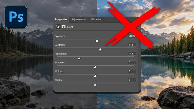
Adobe has quietly introduced a new Light adjustment layer directly within Photoshop’s main interface, drawing immediate attention for its striking resemblance to the tone and exposure controls found in Lightroom and Camera Raw. The visual similarity is intentional, offering a familiar layout for users transitioning between Adobe’s creative applications. However, despite the nearly identical appearance, the behavior of this new layer differs significantly from what users expect in Lightroom.
This discrepancy has sparked concern among content creators who rely on consistent workflows across Adobe’s ecosystem. While the sliders, labels, and overall design mirror those in Lightroom, the underlying processing and non-destructive editing mechanics do not function the same way. As a result, adjustments made using Photoshop’s Light layer may not translate predictably when files are moved between applications or when users assume parity in functionality.
The introduction reflects Adobe’s effort to streamline access to core adjustment tools without requiring users to open Camera Raw or switch modules. Yet, the lack of behavioral consistency risks creating confusion, especially for educators, tutorial creators, and professionals who teach or produce content based on Lightroom-specific techniques. Creators are now advised to test the new layer carefully and verify how adjustments affect their files in different contexts.
For content creators building tutorials, presets, or multi-app workflows, understanding this visual-functional gap is essential. Adobe has not yet clarified whether future updates will align the behavior more closely with Lightroom, leaving users to navigate the difference through hands-on experimentation. Until then, the Light layer in Photoshop remains a case of familiar looks, unfamiliar results.
Join the conversation
Load Facebook comments to read and reply using your Facebook account.