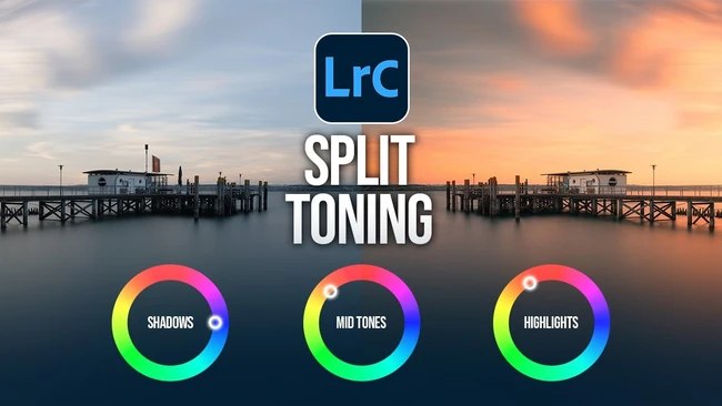
For many landscape shooters, sunset editing often devolves into a series of brute-force adjustments: dragging the temperature slider, boosting saturation, and hoping the foreground doesn’t look unnatural. But a recent Fstoppers article highlights one Lightroom panel that remains surprisingly underused despite its power to solve exactly that color puzzle: the Color Grading panel. The piece points to a common scenario where warm highlights, cool shadows, and a distracting green cast in the foreground need to feel intentional rather than accidental—and that difference can turn a flat raw file into an image viewers stop scrolling to see.
Color Grading, the evolution of the old Split Toning panel, allows creators to independently control hue, saturation, and luminance in the shadows, midtones, and highlights. For a sunset scene, applying a subtle warm tint to highlights while introducing a complementary cool blue to shadows immediately adds depth and atmosphere. Meanwhile, the neglected green cast in the foreground—often a side effect of mixed lighting or foliage—can be neutralized using the midtones wheel without affecting the sky. The result is a cohesive look that feels polished, not pushed.
The creator-business angle here is straightforward. As platforms reward high-quality, engaging images, the difference between a “good enough” edit and one that communicates intentionality directly affects reach and revenue. A sunset shot with controlled color separation is more likely to be saved, shared, or featured, giving creators who master this panel a distinct competitive advantage. Many skip Color Grading because it seems more complex than the Basic panel, but the payoff in audience perception often justifies the learning curve.
According to the Fstoppers article, getting those sunset tones right isn’t about dramatic effects—it’s about subtle, deliberate adjustments. Whether you’re building a portfolio for clients or feeding a social feed, the Color Grading panel offers a precision that basic sliders can’t match. It’s the tool that separates the accidental from the intentional, and for landscape creators, that distinction can make all the difference.
Join the conversation
Load Facebook comments to read and reply using your Facebook account.